
Data is fun
This is a story about a graph.
Inspiration struck just before sunrise one Sunday morning. 8 of us, too tired to sleep, decided to construct a relationship map of the local swing dancing scene. Naturally, the discussion turned to relationships on a micro level … who dances with who, who asks who, and the like, a topic quickly abandoned since gossip is a much more readily available data at 5am in the morning. But the seed was sown and my mind was compelled to tend it. On Monday I borrowed a copy of Tufte’s The Visual Display of Quantitative Information from work and, well, if you don’t feel like drawing a graph after reading that book there is something wrong with you.
Collection
On the following Wednesday I packed up my laptop and set off to brat pack (my performance troupe) rehearsal. Innocuously planted in the line of other machines waiting to play music or show off videos, my iSight went unnoticed as it snapped a picture of the dance floor every second during social dancing, weaving them together into a little over 1 minute of footage.
That Friday after a few too many post work beers at the local, being in an appropriate data collection mood I reviewed the footage and created a two column table: lead on the left, follow on the right, one row per song. The low quality of the iSight made identifying couples towards the rear of the hall tricky, but the tendency of dancers to generally wear distinctly colored clothes made it possible.
Presentation
A brief stint of research led me to Processing, a Java environment for creating neat data visuals. I would have preferred something with ruby, but you take what you can get. My Java was a bit rusty, and the collection handling was downright clumsy to what I was used to in ruby, but after a Saturday of hacking I had something I’m quite proud of. Behold, the "dancing network of brat pack for the 15th August:
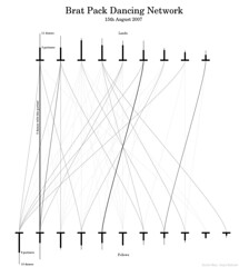
I tried to apply many of Tufte’s ideas in the creation of this graph. It was initially presented vertically, but I rotated it so it was easier to compare the histograms. Chart-junk is kept to a minimum, only the horizontal lines representing each dancer are non-data carrying, and the connecting lines were deliberately thinned and lightened to make interpreting the myriad of partnerships easier. Labels use a serif font and also provide scale information and except for one are all presented horizontally.
Looking forward, I’d like to collect some richer data – both more of the same and also extra information like tempo of song – to incorporate into the graph. I suspect the best way to do this would be to record normal video rather than timelapse, to both grab the audio and also make identifying partnerships easier.